⚡ GMapsBook.com is crafted by Jozef Sorocin (🟢 Book a consulting hour) and powered by:
- Spatialized.io (Elasticsearch & Google Maps consulting).
- and Garages-Near-Me.com (Effortless parking across Germany)
The materials presented in this chapter deal with low-level APIs. If you’re using a framework like React or Angular, make sure to check out the chapter on Working with Frameworks.
ScenarioApproachMarker design: best practicesMarker icons using URLsMarker positioning: anchoring deep diveCrystal clear image icons: a primer on SVGs and SVG encodingDynamic SVGs
These labels were originally designed for rather simple use cases like navigation — think routing from
A to B via C. As the web evolved, people started replacing default markers with increasingly complex shapes — think real estate listing pins, marker clusters, brand logos and such.
To address this, Google gave developers a helping hand by releasing libraries like the
v3-utility-library and esp. markerwithlabel.These libraries abstracted away some complexity but most people still resorted to either:
- static, server-generated image icons accessible via URLs
- or dynamic, SVG-based icons which offered the most customizability.
To this day, custom marker labels pose a challenge to Google Maps newbies and practitioners alike. In this chapter, we’ll reduce the complexities of marker labels to the minimum and learn how to bend them to our will.
Scenario
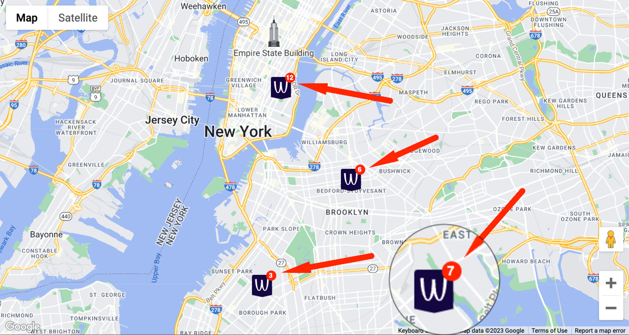
I’m developing a Google map for the “Careers” page of a restaurant chain. I want:
- The restaurant logo to replace Google’s default red pins.
- To display a “bubble” with the number of open positions in the top right corner of each pin.

Approach
Marker design: best practices
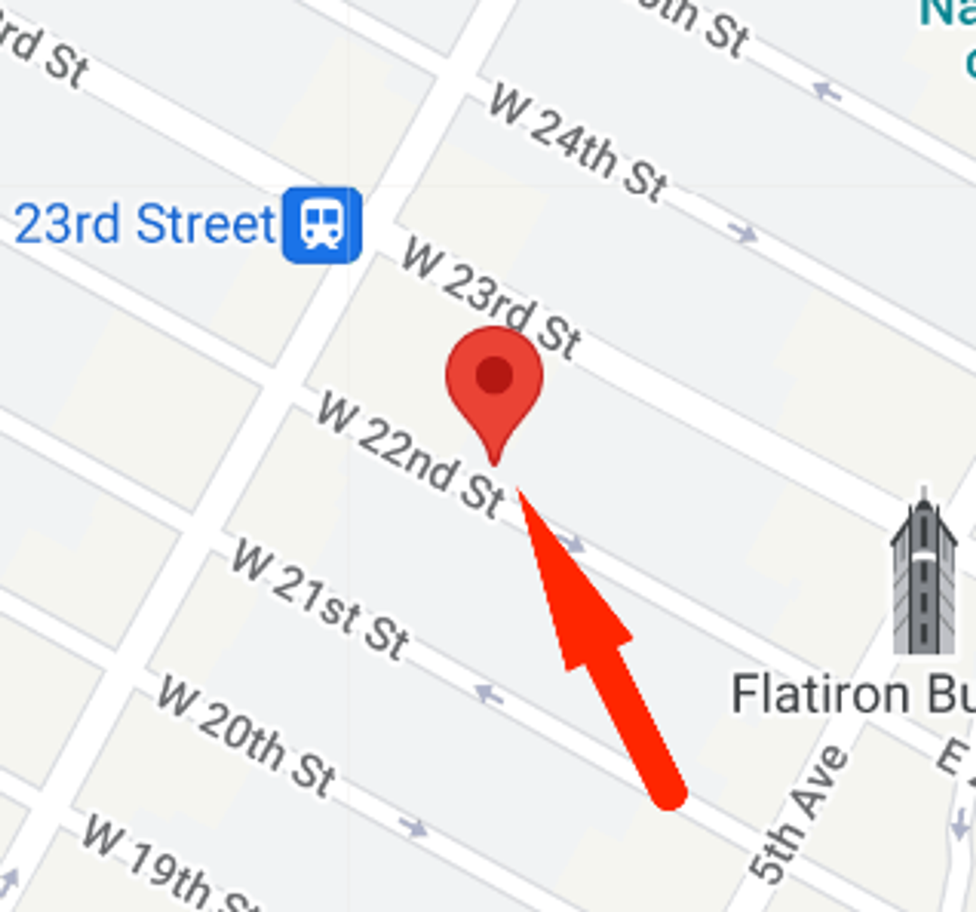
Unless you’re using markers to indicate approximate locations or mark larger areas, your markers will always pinpoint a precise location. After all, that’s where the thumbtack/pin emojis 📌 📍 come from — their bottom end locates the point of interest.

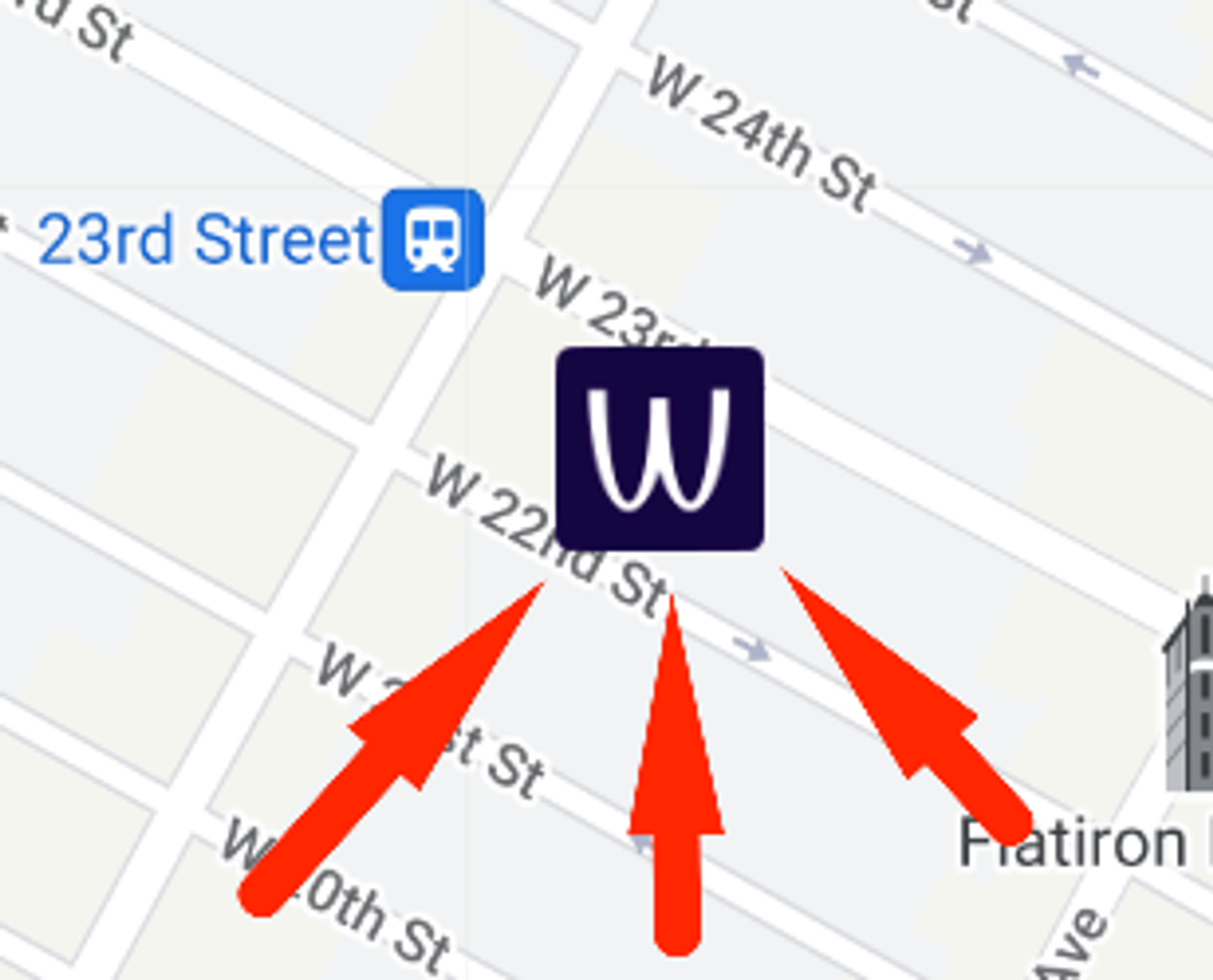
Now, if your custom pin image doesn’t have a V-shaped edge, the target location will be unintentionally ambiguous!

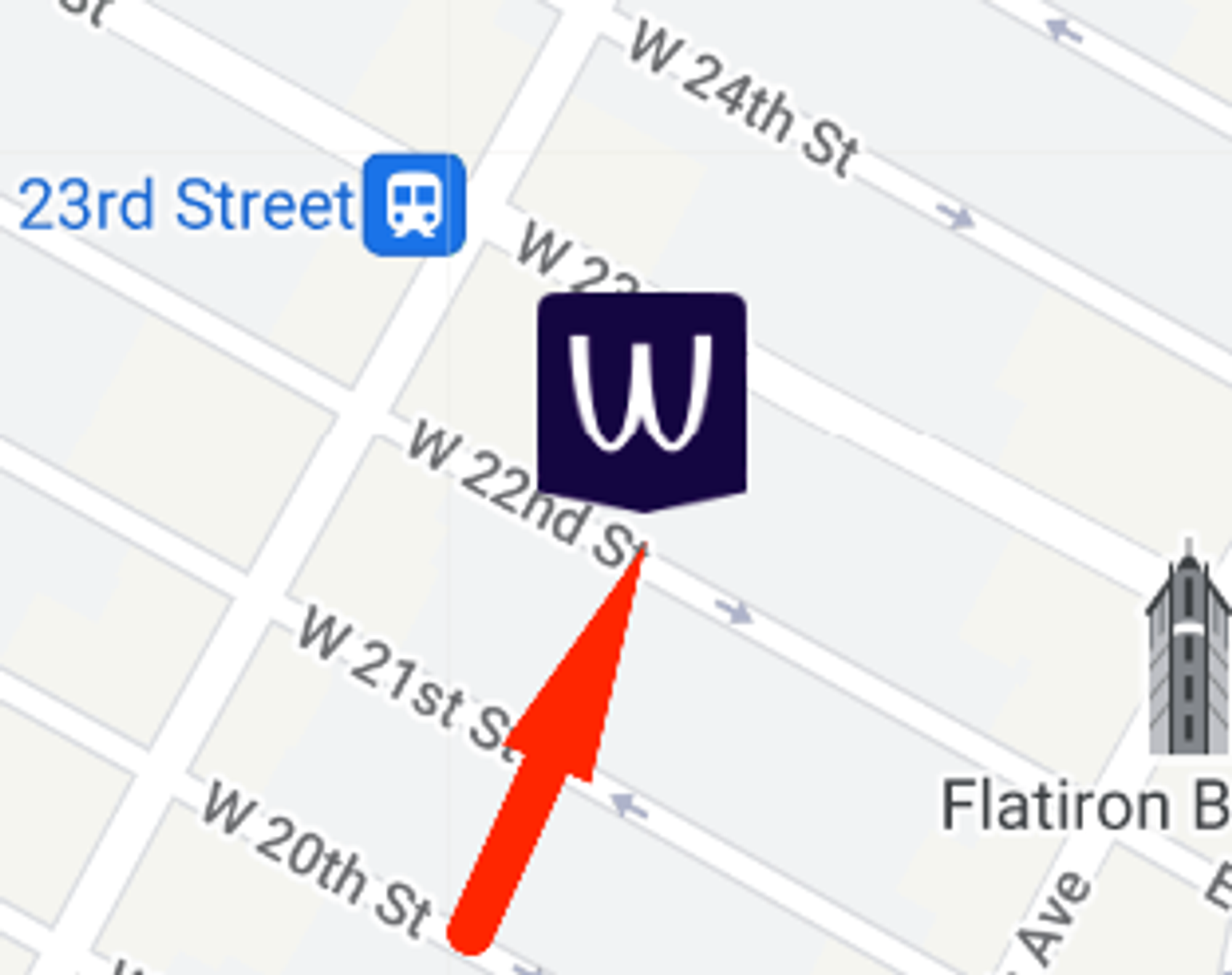
Having a V-shaped edge on either side of the pin clearly marks the target location and removes any ambiguity from the picture.
V-shaped bottom edges (”tapered stems”) are the de-facto standard on real estate websites. See for instance Garages-Near-Me.com

Generally speaking, your markers should:
- adhere to the general design recommendations for Google Maps
- be large enough to be easily distinguishable from other elements on the map
Marker icons using URLs
Given an image URL like of known dimensions (eg. 145 x 158px), we’ll quickly notice that’s its too big for the map:
const marker = new google.maps.Marker({
  map,
  position: { lat: 40.7419, lng: -73.9921 },
  icon: {
    url: 'https://storage.googleapis.com/gmaps-handbook/public/common/2/2.3/pin-with-bubble.png'
  },
});